I love LingQ! But I have been thinking about how one could solve some of the main frustrations that I have when using LingQ in my browser (some of which also carry over to the mobile app experience).
I will be mentioning mouse-clicking a lot! This may seem crazy at first, but trust me, it isn’t. I ask that you give it a chance.
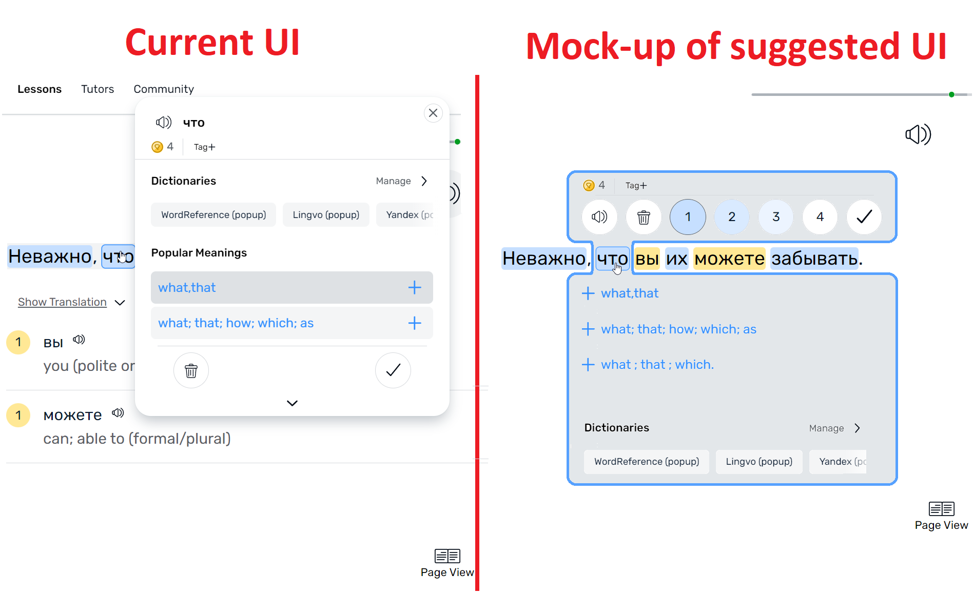
I have made a mock-up of a couple of changes that I think might be good. I will explain them.
First the frustrations, then the solutions.
Frustrations:
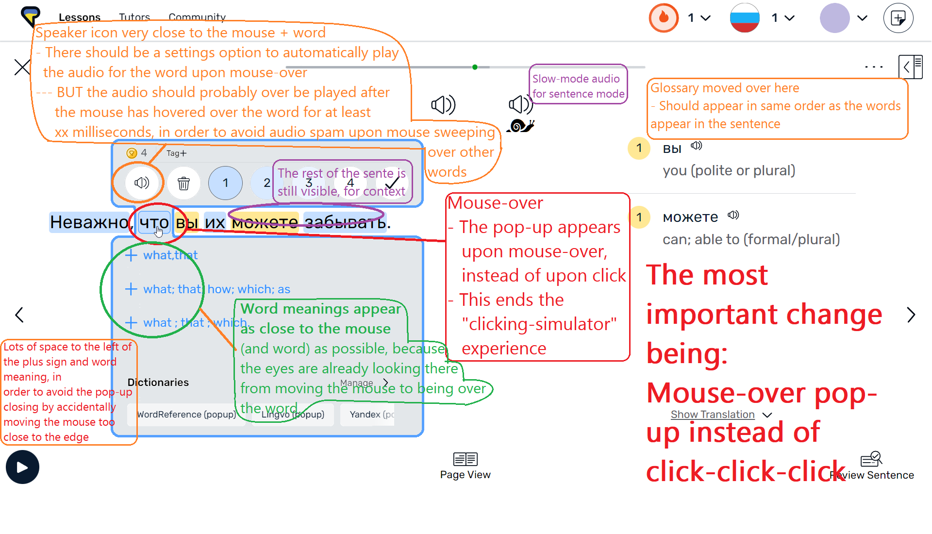
- There’s an awfully lot of clicking involved in using LingQ. Every time I want to look up a word (whether it be blue or yellow), I have to click. Then for a blue word, I click a meaning. Then the pop-up disappears. If I want to add an additional meaning, I have to click on the word again, then click the little down-arrow, then scroll, then add the additional meaning. This can lead to having to click maybe 10-30 times just to read a single sentence.
- The pop-up obscures the rest of the sentence. This creates an additional problem if I use the arrow keys to open the pop-up for a blue word, because now I can’t read the rest of the sentence.
- The word meaning is placed visually away from where I just looked (i.e. the word I clicked), and the “plus sign” for adding a meaning is very very far away. Lots of clicking and moving the mouse around, which distracts from the regular reading experience.
- The pop-up can change size pretty dynamically which causes even more “looking around in order to locate the thing I’m looking for”.
Solutions:
I explain further below this image
- It occurred to me that most of the clicking is completely redundant; the only situation I would move my move to be over a word, is when I’m about to click the word, to create LingQs or lookup the meaning. So we might as well cut-out that click, which would heavily reduce the total amount of clicking-clicking-clicking, that is the current LingQ web experience. So,
- The pop-up could appear on mouse-over. Often I just want to remind myself of the meaning, and I’m not expecting to add new meanings. So making it appear on mouse-over would mean that many many of the clicks involved in reading a sentence well be completely gone. And for sentences with no new words, there would be no need to click at all.
- The pop-up is changed in such a way that the thing I’m usually looking for, is always very very close to where I was already looking; if I want to look up the meaning of a word, then I have already just looked at the word to move my mouse over there, so it’s a good idea to place the meaning very very close to that. That also goes for the “plus sign” for adding new meanings.
- The pop-up should always have zero delay. That may involve some preloading upon turning the page and arriving at the given sentence. The magic of use-cases where a mouse-over is sufficient, is that it’s so smooth and frictionless. That only works if there is no delay. However, there should be a slight (but only very short) delay on audio playback, as I will explain.
- The audio readout of the word should (optionally) be played upon mouse over (but after a hidden, short delay timer, starting when the mouse goes over a word, in order to avoid playback spam as I move my mouse across other words in order to get to the word I’m looking for). So why should it playback the word audio automatically upon mouse-over? Because otherwise we would be reintroducing the click that we just eliminated. Now, often I might want to hear the audio a couple of times, and in that case, a click is unavoidable. That’s why it would make perfect sense to make automatic mouse-over playback optional; because the speaker icon for the word is placed right next to the word/mouse cursor.
- I have also moved the sentence (and speaker icon) up a bit visually, in order to make more space for the list of meanings for blue words.
Let’s not underestimate the user experience friction created by a large amount of unnecessary mouse-clicks.
Thank you for taking the time to read my feedback.